Fusion Marketplace
My Jobs Feature
Fusion Marketplace was built to empower healthcare travelers to gain transparency and autonomy over their healthcare careers. By creating a more accessible experience for travelers, we’re able to reduce barriers that make their industry difficult to enter.
After the launch of the Fusion Marketplace app, I collaborated with the app Dev team to translate some functionalities from the web (I was the design leader) to the app, to provide a whole on-the-go experience.
From July through September 2022, I worked on helping design the My Jobs feature to help healthcare travelers to find their application status without leaving the app. This feature is essential for our more than five thousand users. This project aimed to improve the user experience and increase engagement in the new app.

Final design
Goal
To improve the user experience of the Fusion Marketplace app by adding core functionality to avoid the necessity of users having to switch from the mobile app to our website in order to access their information.
Team
Product Owner: Brent Walker
Software Engineer: Kevin Van Cott
Business Leader: Stanford Swanson
Product Designer: Alejandro Castillo
Business Problem
Travelers were frustrated that our current platform didn’t allow them to save and review updates on all of their submitted job applications
Product Requirements
The system must allow the users to know when a job application period is closed
The system must allow them to revisit their open job applications
The system will automatically move all closed jobs to the archive
Exploration
A few months after launching the MVP version of the Fusion Marketplace app, we sent out a survey using a volunteer sign-up feature on our website called "Innovators Groups". Because we wanted to hear directly from the users in order to learn about their experience.
While our users had a lot of positive feedback, we also were able to unearth some important pain points, and this question resonates with me:
What do you find most frustrating about the Fusion Marketplace app?
“It is stressful to leave the app just to check my last application”
“It is annoying to have to login and logout every time I want to see if a job offer is closed”
For Healthcare professionals who are always in a rush, this was a problem, because they are always on the go, meaning no time to switch between app and web. The current app structure doesn't allow users to check their history.
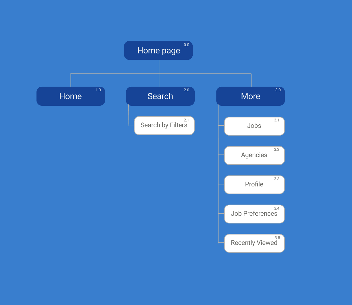
Actual Sitemap does not provide an intuitive way for users to check the history of their application.
Competitive Analysis

Takeaways
I realized the importance of providing a holistic experience to a job seeker by observing popular apps. Also, if more than 80% of our users are mobile and their work doesn't allow them to get distracted. Other essential learnings are:
Most of these apps have similar patterns, to avoid confusion
Most of these apps provide standard features such as a job page and a save feature
Their user journey is very intuitive
This helped narrow my focus on the solutions I could design to meet user needs.
How might we help the travelers?
Q: How might we make it quick and easy for users to check past applications without leaving the app?
A: By adding a new section in the main menu that is connected with users' application activities, and isolating the status of all applications
Q: How might we provide a functionality to save a job post and continue later?
A: By adding a “save” feature to job descriptions and connect it with the job applications functionality
Visualization
Next, I designed two different solutions for this problem. I shared my vision for what this new feature's scenarios would look like from a user perspective with the Dev team.
Collaboration is crucial, and that's why throughout our weekly meetings, I would provide updates to my team about progress on essential details such as new components, vision, and solutions.

This diagram explains how all the behaviors of the two solutions I designed were connected.

The new structure would give users a more intuitive way to search for their history of applications.
Low-Fi Design
Now that I know what are the basic needs that would improve the user needs, I designed two different solutions, that would cover MVP requirements and more.

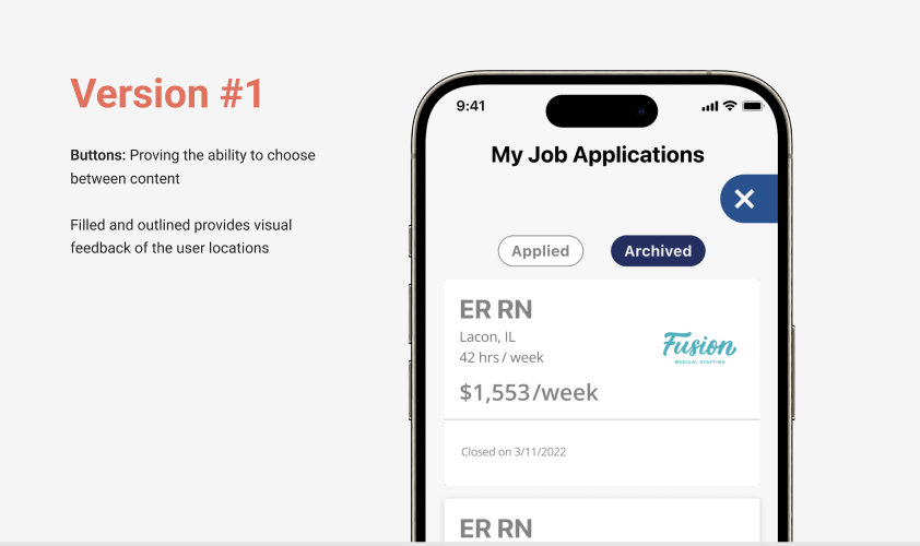
Here are some mock-up ideas for this project. On the left, V#1, and on the right, V#2
Here I took a simple approach covering what the users need to reach their goal in a few minutes and return to their activities.

Solution version #1 meets the MVP requirements.
Here I went beyond and designed a holistic experience for a Healthcare professional who is on their shift, taking a break, then opening the FMP app in a few minutes, saving a few jobs to check later and apply, and now getting back to work.

Solution version #2 meets the MVP requirements, also gives users more flexibility.
High-Fi Design
Refining my designs would give us a sense of how much time and effort would the different versions need, and then make a decision based on the project deadline.

Highlights
Based on the principal project requirements for an MVP the deadlines, and the prioritization of other key features for the app, the team decided to move forward with solution version #1.
Other reasons why we proceeded with solution version #1 include:
Solution version #2 would require more research and validation methods
Solution version #2 would increase the workload of the entire development team, meaning more time for design review, back-end and front-end work, and a more detailed QA process
We couldn’t implement the ability to save a job and view it in My Job applications. For now, users can see their applied and archived history. The resulting design we ended up shipping for v1 looks like this:
